Quick answer: Sublimation color almost never matches a screen or a paper Pantone code exactly, because the dye bonds into the fabric and its final shade depends on the specific textile, weave, and finish. Sportswear of Tomorrow solves this by sending clients a color book printed on the actual production fabric, so you approve the real, physical color before production — eliminating the guesswork that causes reprints.
Ask any team that has ordered custom sublimated kit before, and somewhere in their story there is a color that came back wrong: the blue on screen that turned out purple, the sponsor red that drifted orange, the “close enough” that wasn’t close enough next to the brand guidelines. After 22 years of manufacturing custom sportswear, we stopped trying to fix this after the fact. We send a fabric color book instead. Here is why that works better.
What is a fabric color book?
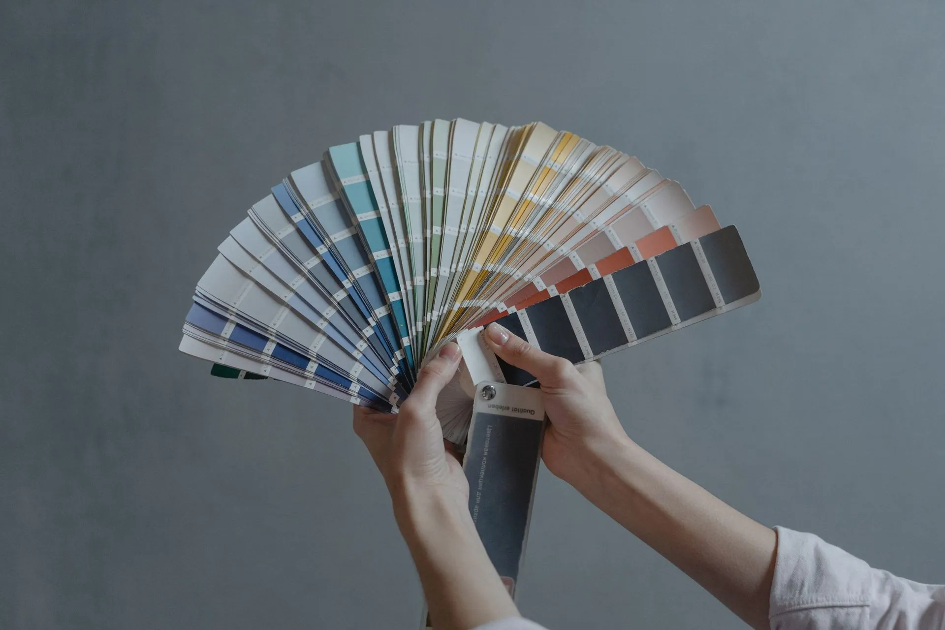
A fabric color book is a physical swatch reference — dozens of colors printed by the manufacturer on the exact fabrics that will be used for the order. It is not a screen, and not a paper Pantone fan. It is the real material, printed the real way, so the color you choose is the color you receive.
When you hold a color book, you are seeing precisely what your team will wear. There is no translation step left to go wrong, because the color already exists as a finished, sublimated swatch in your hand.
Why doesn’t sublimation match a Pantone code or a screen?
Sublimation color does not match a Pantone code because sublimation is not ink sitting on top of fabric — it is dye turning to gas and bonding into the fibers. The final shade depends on variables a code cannot capture:
- Base fabric and fiber content — the same red reads differently on recycled polyester than on nylon.
- Weave and texture — a tight knit reflects light differently than an open mesh.
- Stretch and finish — tension and surface coating shift how pigment appears.
- Light source — screens emit light; fabric reflects pigment. They are different color languages.
A Pantone reference is printed on coated paper under standardized light. Your jersey is dyed polyester under stadium floodlights. Asking a manufacturer to “match the code” is asking them to predict how a color behaves across a chemical process, on a specific textile, under real conditions. Predictions carry error. Error becomes reprints.
How does a color book prevent reprints?
A color book prevents reprints by moving color approval to the front of the process, onto the real material, before anything goes into production. The single most expensive moment in custom kit is opening the delivery box and finding the color off. Because you approve a physical swatch up front, that moment is removed entirely — there is nothing left to translate or misjudge.
Why is a fabric color book better than digital color matching?
- You see reality, not a promise. Screens, lighting, and even calibrated monitors disagree with each other. Fabric doesn’t. What’s in the book is what’s on the pitch.
- No surprises at delivery. Approval happens on the real material, so the finished garment holds no surprises.
- Faster approvals. Instead of rounds of digital proofs and “can you make it slightly warmer” emails, you point at a swatch. Decision made, production starts sooner.
- Consistency across reorders. Your chosen color is locked to a printed reference you both hold, so next season matches this season with no drift.
- Sponsor and brand confidence. A physical swatch is something you can put in front of a stakeholder for a real sign-off — essential when a sponsor’s identity is on the kit.
How the color book process works with Sportswear of Tomorrow
- We send you a color book printed on the fabrics selected for your project.
- You choose your colors from real, physical swatches — in your own hands, under your own lighting.
- We produce to the swatch you approved, not to a code we hoped would translate.
- Your approved reference stays consistent for every future order.
Frequently asked questions
Can’t you just match a Pantone number exactly? Not reliably on sublimated fabric. A Pantone number is a coated-paper standard viewed under controlled light. Sublimated polyester under real light will read differently, and by how much depends on the fabric. A color book shows you the true printed result so there is no guessing.
Does the fabric type really change the color that much? Yes. The same dye recipe can look noticeably different across fabrics because weave, fiber, stretch, and finish all change how pigment reflects light. This is exactly why the swatches in a color book are printed on the fabrics used for your order, not on paper.
How do I keep colors consistent across reorders? Choose from the color book and your color is tied to a physical, printed reference held by both you and the manufacturer. Every future order is produced to that same swatch, which removes seasonal color drift.
Is a color book only useful for teams with sponsors? No, but it matters most where color is non-negotiable. Any team benefits from seeing real color before committing; teams carrying sponsor or brand identities benefit most, because a physical swatch lets stakeholders sign off on the true shade.
How do I request a color book? Contact us at hello@sportswearoftomorrow.com and tell us about your project. We’ll send a color book printed on the fabrics selected for your order.
The bottom line
Color matching asks you to trust a prediction. A fabric color book lets you trust your own eyes. Across more than two decades of making custom sportswear, we have found the second approach wins every time — fewer reprints, faster approvals, and kit that looks exactly like the team pictured it. If you are planning an order, ask us for a color book and see your colors on real fabric before you commit.